THE TIMES
I worked with the editorial team to design and build a suite of bespoke tools, starting with a fairly substantial new tool that would allow editors to create and manage The Times and Sunday Times digital editions.
Unlike most News companies that provide a continually updating website of rolling stories and liveblogging, The Times supports a unique, edition-based service, collating the best and the most important stories, releasing them at milestones throughout the day. The new tool needed to allow the editors to do this quickly and easily. As well and supporting new features that were previously unavailable to them.
initial research
When I arrived the project was in its infancy stages and the scope of the new tool had yet to be been defined. It was an ideal time for me to start talking to the editors (end users) about what was and wasn’t working with the existing tools and process.
Identifying pain points with the current system allowed us to avoid making the same mistakes. We also heard the users needs first hand and this was hugely important when deciding which features to build and in which priority order.
I gathered insights using contextual inquiry methodologies to obtain information in context of use, observing users as they worked in their natural environments and asking questions.

The news room
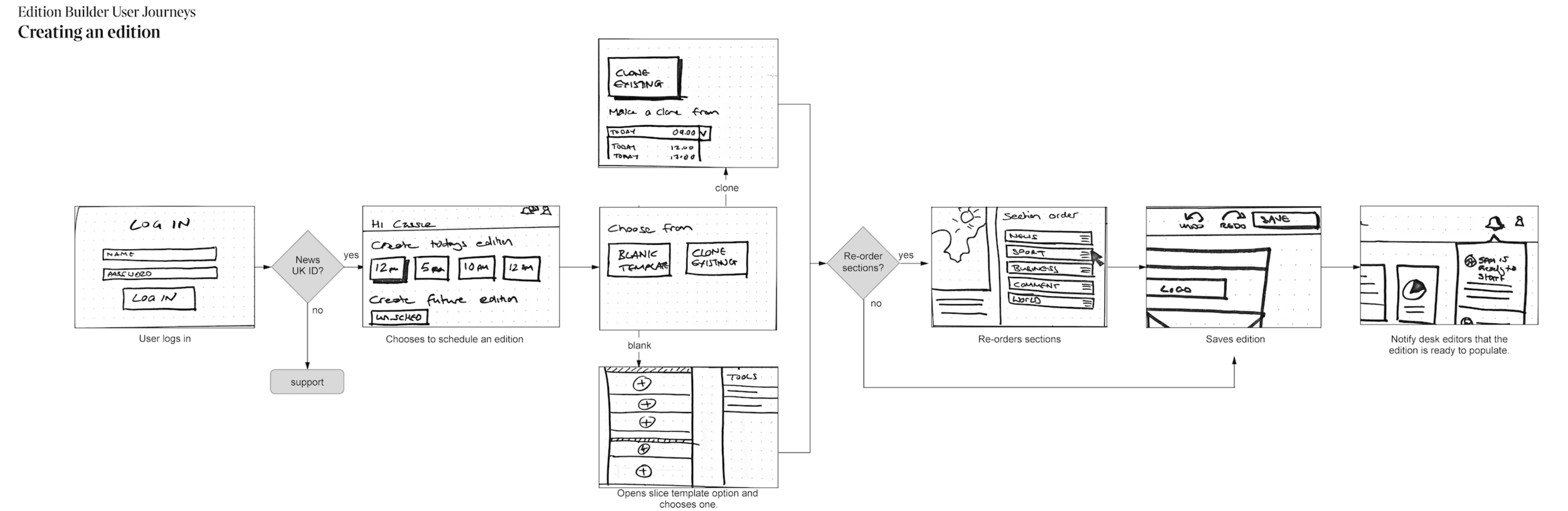
Wire flow of edition creation journey
Design phase
Using the research insights to identify key user goals I started to create the user flows. I later added wireframes to these flows to help visualise the experience, sharing them with the project team and stakeholders. After further sketching and iterations I had a set of designs that I was ready to test.
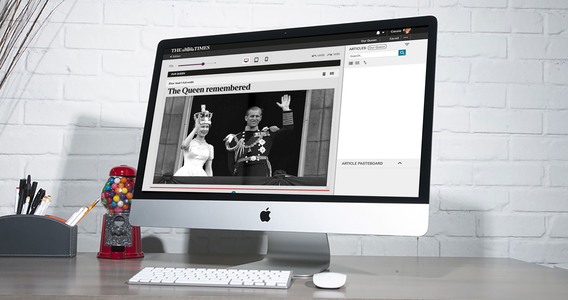
The tool would contain a library of editions (digital versions of the newspaper), which then contained section pages for different categories. Categories (like World News or Sport) would change from day to day. These section pages were then made up of modules (known internally as slices) where the articles and video content could be placed.

Early wireframes of WYSIWYG editor

Final design of WYSIWYG editor

Prototype usability
Testing and iteration
I started by testing the section page as this is where 80% of the functionality would be housed. Here users could create and edit the page layout and decide where the articles should go.
I created basic wireframes for the key actions and tested them with the end users (editors). Overall the feedback was very positive. Users liked the what you see is what you get interface (WYSIWYG) and how easy it was to position and reposition the content easily.
They also helped us in identifying usability pain points and new requirements.
I adapted the wireframes to improve on these areas as well as exploring new pages and features before testing again. The wireframes were tested and updated a further two times before I started applying the visual polish. Once the UI was complete I tested again, only this time with a working product.
Pattern library
I wasn’t just designing a pattern library for one tool, this would be the first in a suite of editorial tools. This meant that I needed to use design elements that could be reused time and time again. Therefore they needed to be flexible and future proofed.
We created a pattern library to document all of these elements or ‘patterns’, defining how they look, how they behave, and how they are coded.

What next
A beta version of the tool is in circulation and we are continuing to implement user feedback. We are also working on the next set of features with the MVP tool scheduled to be used in production before the winter.